Theming
Customize the look and feel of Ivandt Importer to match your brand
Ivandt Importer is fully themeable using CSS variables. You can customize colors, borders, spacing, and more to match your brand identity.
Reference
Complete Variable List
| Variable | Description | Default (Light) | Default (Dark) |
|---|---|---|---|
| Base Colors | |||
--ivt-color-base | Main background color | #ffffff | #020010 |
--ivt-color-base-content | Text color on base backgrounds | #020010 | #ffffff |
| Primary | |||
--ivt-color-primary | Main action color (buttons, CTAs) | #020010 | #f9fafb |
--ivt-color-primary-content | Text on primary backgrounds | #ffffff | #020010 |
| Secondary | |||
--ivt-color-secondary | Supporting actions | #1a2b4a | #60a5fa |
--ivt-color-secondary-content | Text on secondary backgrounds | #ffffff | #020010 |
| Accent | |||
--ivt-color-accent | Highlights and interactive states | #3b82f6 | #3b82f6 |
--ivt-color-accent-content | Text on accent backgrounds | #ffffff | #ffffff |
| Neutral | |||
--ivt-color-neutral | Structural elements | #0f1540 | #0f1540 |
--ivt-color-neutral-content | Text on neutral backgrounds | #ffffff | #e5e7eb |
| Info | |||
--ivt-color-info | Informational messages | Blue | Light Blue |
--ivt-color-bg-info | Info background (with opacity) | Blue (20%) | Light Blue (20%) |
--ivt-color-info-content | Text on info backgrounds | Near White | Dark Blue |
| Success | |||
--ivt-color-success | Success states | Green | Light Green |
--ivt-color-bg-success | Success background (with opacity) | Green (20%) | Light Green (20%) |
--ivt-color-success-content | Text on success backgrounds | Near White | Dark Green |
| Warning | |||
--ivt-color-warning | Warning states | Orange | Light Yellow |
--ivt-color-bg-warning | Warning background (with opacity) | Orange (20%) | Light Yellow (20%) |
--ivt-color-warning-content | Text on warning backgrounds | Near White | Dark Brown |
| Error | |||
--ivt-color-error | Error states | Red | Light Red |
--ivt-color-bg-error | Error background (with opacity) | Red (20%) | Light Red (20%) |
--ivt-color-error-content | Text on error backgrounds | Near White | Dark Red |
| Layout | |||
--ivt-radius-box | Border radius for containers | 0.1rem | 0.1rem |
--ivt-radius-field | Border radius for input fields | 0.1rem | 0.1rem |
--ivt-radius-selector | Border radius for dropdowns | 0.1rem | 0.1rem |
--ivt-size-field | Height multiplier for fields | 0.25rem | 0.25rem |
--ivt-size-selector | Size for selector elements | 0.25rem | 0.25rem |
--ivt-border | Border width | 1px | 1px |
| Dialog | |||
--ivt-dialog-width | Dialog width | 100% | 100% |
--ivt-dialog-max-width | Maximum dialog width | 90vw | 90vw |
--ivt-dialog-height | Dialog height | 90vh | 90vh |
--ivt-dialog-backdrop-blur | Backdrop blur amount | 3px | 3px |
--ivt-dialog-z-index | Dialog stacking order | 9999 | 9999 |
You only need to override the variables you want to change. All others will use their default values.
Default Theme
The importer comes with a built-in dark navy blue and white theme that works in both light and dark modes.
import { IvtSchema } from "@ivandt/importer";import { defaultSchemaProps } from "@/app/schemas/defaultSchemaProps";export const themeExampleSchema: IvtSchema = { ...defaultSchemaProps, key: "themeExampleSchema", fields: [ { type: "text", label: "Product Name", key: "productName", validators: [{ type: "required" }], }, { type: "dropdown", label: "Category", key: "category", options: [ { label: "Electronics", value: "electronics" }, { label: "Clothing", value: "clothing" }, { label: "Food", value: "food" }, ], }, { type: "numeric", label: "Price", key: "price", validators: [{ type: "required" }, { type: "min", value: 0 }], }, ],};How Theming Works
Ivandt uses CSS variables (custom properties) that you can override.
Customizing Themes
Basic Customization
Override theme variables using CSS. Target the component with the data-selected-mode attribute:
/* Light mode customization */
ivt-importer[data-selected-mode='light'] {
  --ivt-color-primary: #your-brand-color;
  --ivt-color-primary-content: #ffffff;
}

/* Dark mode customization */
ivt-importer[data-selected-mode='dark'] {
  --ivt-color-primary: #your-brand-color;
  --ivt-color-primary-content: #000000;
}
The data-selected-mode attribute works with all Ivandt components: ivt-importer, ivt-importer-button, ivt-importer-dialog, and ivt-importer-page.
Complete Theme Example
Here's a complete custom theme with rounded corners and a green color scheme:
import { IvtSchema } from "@ivandt/importer";import { defaultSchemaProps } from "@/app/schemas/defaultSchemaProps";export const themeExampleSchema: IvtSchema = { ...defaultSchemaProps, key: "themeExampleSchema", fields: [ { type: "text", label: "Product Name", key: "productName", validators: [{ type: "required" }], }, { type: "dropdown", label: "Category", key: "category", options: [ { label: "Electronics", value: "electronics" }, { label: "Clothing", value: "clothing" }, { label: "Food", value: "food" }, ], }, { type: "numeric", label: "Price", key: "price", validators: [{ type: "required" }, { type: "min", value: 0 }], }, ],};ivt-importer[data-selected-mode='light'] {/* Base colors */--ivt-color-base: #ffffff;--ivt-color-base-content: #064e3b;/* Primary - main actions */--ivt-color-primary: #059669;--ivt-color-primary-content: #ffffff;/* Secondary - supporting actions */--ivt-color-secondary: #10b981;--ivt-color-secondary-content: #ffffff;/* Accent - highlights */--ivt-color-accent: #34d399;--ivt-color-accent-content: #064e3b;/* Rounded corners */--ivt-radius-box: 1rem;--ivt-radius-field: 0.5rem;--ivt-radius-selector: 0.5rem;}ivt-importer[data-selected-mode='dark'] {/* Base colors */--ivt-color-base: #064e3b;--ivt-color-base-content: #d1fae5;/* Primary - main actions */--ivt-color-primary: #34d399;--ivt-color-primary-content: #064e3b;/* Secondary - supporting actions */--ivt-color-secondary: #10b981;--ivt-color-secondary-content: #064e3b;/* Accent - highlights */--ivt-color-accent: #6ee7b7;--ivt-color-accent-content: #064e3b;/* Rounded corners */--ivt-radius-box: 1rem;--ivt-radius-field: 0.5rem;--ivt-radius-selector: 0.5rem;}Best Practices
Start with Base Colors
Begin by setting --ivt-color-base and --ivt-color-base-content. These are the foundation of your theme.
ivt-importer[data-selected-mode='light'] {
  --ivt-color-base: #ffffff;
  --ivt-color-base-content: #1a1a1a;
}
Set Primary Color
Your primary color should be your brand color. This is used for main actions.
ivt-importer[data-selected-mode='light'] {
  --ivt-color-primary: #your-brand-color;
  --ivt-color-primary-content: #ffffff; /* Ensure good contrast */
}
Ensure Contrast
Always ensure sufficient contrast between colors and their content colors for accessibility.
- Primary/content should have at least 4.5:1 contrast ratio
- Base/content should have at least 4.5:1 contrast ratio
- Use tools like WebAIM Contrast Checker
Test Both Modes
If you support both light and dark modes, test your theme in both to ensure consistency.
/* Light mode */
ivt-importer[data-selected-mode='light'] {
  --ivt-color-primary: #0066cc;
}

/* Dark mode */
ivt-importer[data-selected-mode='dark'] {
  --ivt-color-primary: #4da6ff;
}
Common Patterns
Brand Color Integration
Match your company's brand colors:
ivt-importer[data-selected-mode='light'] {
  --ivt-color-primary: #ff6b6b; /* Your brand red */
  --ivt-color-primary-content: #ffffff;
  --ivt-color-accent: #ffd93d; /* Your brand yellow */
  --ivt-color-accent-content: #1a1a1a;
}
Minimal Theme
Create a clean, minimal look with subtle colors:
ivt-importer[data-selected-mode='light'] {
  --ivt-color-base: #fafafa;
  --ivt-color-base-content: #2a2a2a;
  --ivt-color-primary: #2a2a2a;
  --ivt-color-primary-content: #ffffff;
  --ivt-color-secondary: #6b7280;
  --ivt-color-secondary-content: #ffffff;
  --ivt-radius-box: 0.25rem;
  --ivt-radius-field: 0.25rem;
}
Component-Specific Styling
Targeting Specific Components
Each Ivandt component can be styled independently:
/* Style only the dialog */
ivt-importer-dialog[data-selected-mode='light'] {
  --ivt-color-primary: #your-color;
}

/* Style only the button */
ivt-importer-button[data-selected-mode='light'] {
  --ivt-color-primary: #your-color;
}

/* Style only the page */
ivt-importer-page[data-selected-mode='light'] {
  --ivt-color-primary: #your-color;
}
Loading Styles
Inline Styles
For quick testing or dynamic themes:
<ivt-importer
  data-selected-mode="light"
  style="
    --ivt-color-primary: #your-color;
    --ivt-color-primary-content: #ffffff;
  "
></ivt-importer>
External Stylesheet
For production use, create a separate CSS file:
ivt-importer[data-selected-mode='light'] {
  --ivt-color-base: #ffffff;
  --ivt-color-base-content: #1a1a1a;
  --ivt-color-primary: #0066cc;
  --ivt-color-primary-content: #ffffff;
}

ivt-importer[data-selected-mode='dark'] {
  --ivt-color-base: #1a1a1a;
  --ivt-color-base-content: #ffffff;
  --ivt-color-primary: #4da6ff;
  --ivt-color-primary-content: #1a1a1a;
}
Then import it in your application:
<link rel="stylesheet" href="importer-theme.css">Troubleshooting
Theme Not Applying
Make sure you're targeting the correct component with the data-selected-mode attribute.
/* ❌ Wrong - missing data-selected-mode */
ivt-importer {
  --ivt-color-primary: #your-color;
}

/* ✅ Correct */
ivt-importer[data-selected-mode='light'] {
  --ivt-color-primary: #your-color;
}
Visual Theme Designer
Don't want to write CSS by hand? Use our visual theme designer to create your perfect theme with a live preview.
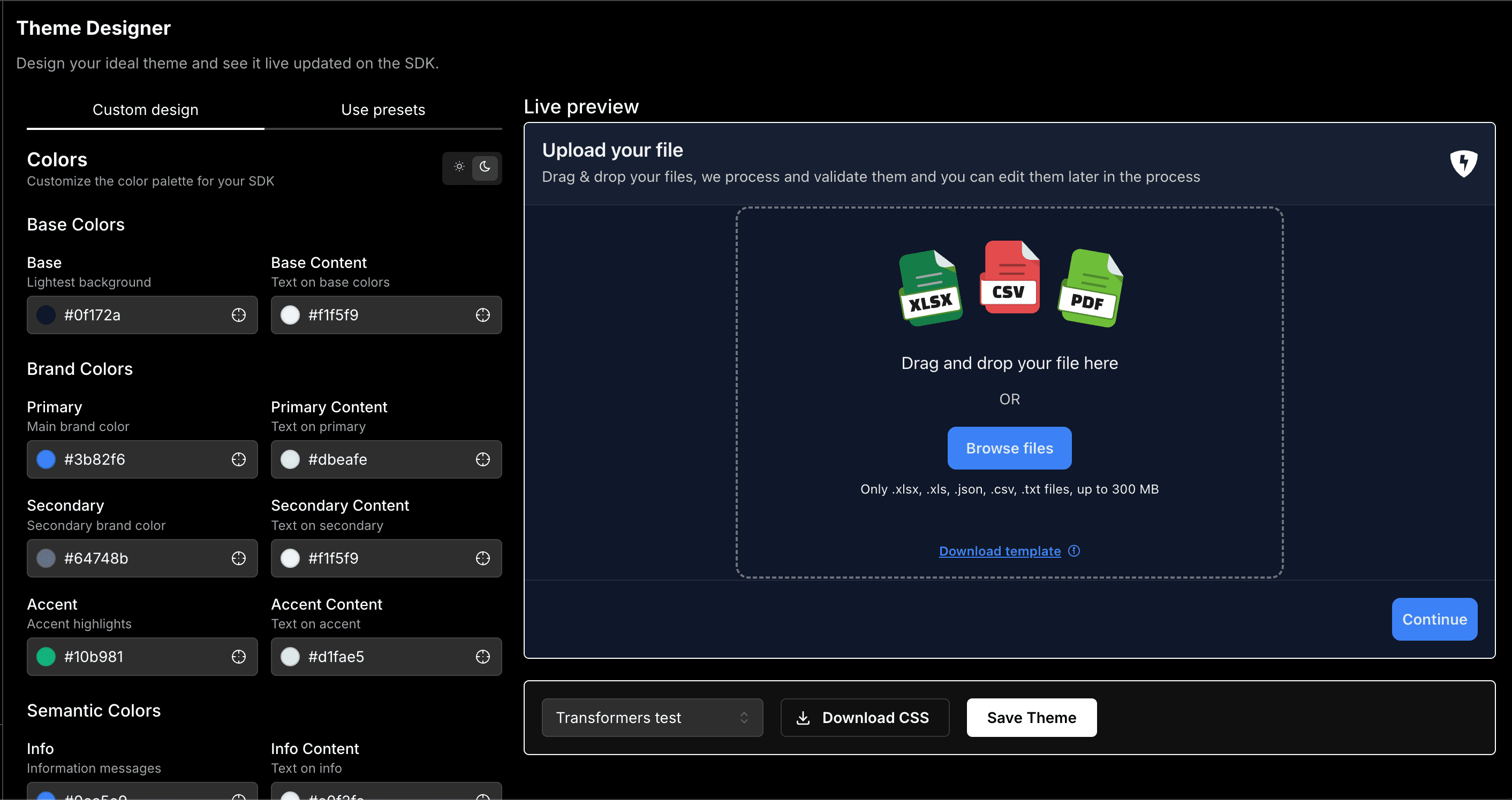
Features
The Ivandt Theme Designer at ivandt.com/design provides an intuitive interface for creating custom themes:
- Live Preview - See your theme changes instantly on a real importer instance
- Color Pickers - Visual color selection for all theme variables
- Preset Themes - Start with professionally designed presets and customize from there
- Real-time Updates - Watch the SDK update as you adjust colors and styles
- Export Options:
- Download as CSS file for immediate use
- Save as your default theme for all templates
- No Code Required - Perfect for designers and non-technical team members
How to Use
Visit the Designer
Go to ivandt.com/design and log in to your account.
Choose Your Starting Point
Start with a preset theme or create a custom design from scratch. Presets include popular color schemes that you can use as-is or customize.
Customize Colors
Use the color pickers to adjust:
- Base colors (background and text)
- Brand colors (primary, secondary, accent)
- Semantic colors (info, success, warning, error)
The live preview updates instantly as you make changes.
Test with Real Data
Upload a sample file to see how your theme looks with actual data in the table view. This helps ensure your colors have proper contrast and readability.
Save or Download
Choose how to use your theme:
- Download CSS - Get a ready-to-use CSS file with all your theme variables
- Save as Default - Make this theme the default for all your templates
Benefits
The Theme Designer is the fastest way to create a custom theme without writing any code. It's perfect for:
- Quickly matching your brand colors
- Testing different color combinations
- Creating themes for different clients or projects
- Ensuring proper contrast and accessibility
Integration
Once you've downloaded your theme CSS file, integrate it into your application:
<!-- Add to your HTML -->
<link rel="stylesheet" href="path/to/your-theme.css">

<ivt-importer data-mode="light" schema={schema}></ivt-importer>
The downloaded CSS file contains all the necessary data-selected-mode selectors and variable overrides, ready to use immediately.