Field Types
Complete reference for all field types in Ivandt
Ivandt provides multiple field types, each with its own UI component and behavior. Choose the right field type based on your data requirements.
Text
Simple text input for string values
Numeric
Number input for integers and decimals
Monetary
Currency field with locale support
Date
Date input with automatic parsing
Phone
Phone number with country validation
Checkbox
Boolean field for true/false values
Dropdown
Searchable dropdown with static or remote options
Password
Masked input for sensitive data
Combine
Computed field from other fields
Common Properties
All field types share these common properties:
Required Properties
type- The field type determines the UI component and behavior. Each type has its own interface with specific properties.label- The display name for this field shown in column headers and the mapping step. This is what users see in the UI.key- The unique identifier for this field used in the data structure. This is the property name in the final JSON output. Must be unique across all fields in the schema.
Optional Properties
validators- An array of validation rules to apply to this field. Validators are automatically sorted by importance and the validation is on a "early-exist" mechanism, meaning if the first validator fails to pass, an error is produced and the rest of the validators won't run.transformers- An array of transformation actions to apply to this field. Transformers clean, format, or modify cell values automatically. They run at different stages (load, cell changes, invalid cells) based on their type.readOnly- Whether this field can be edited or not. Default:falseplaceholder- When field is empty, the placeholder is shown, similar to native HTML field placeholders.description- A string that describes the field's purpose. The description will appear in the header mapping step under each field. It will also appear with an exclamation icon at the top of each column in the Review step.
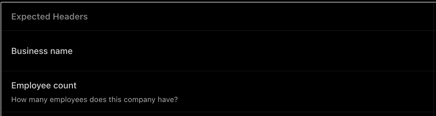
###Example
{
  type: 'numeric',
  label: 'Employee count',
  key: 'employeeCount',
  description: 'How many employees does this company have?'
}
columnWidth- By default the SDK tries to allocate enough space for each column based on the field label length. However, you may want a column to be wider (e.g., for an Address column where the label is short but content is long). ThecolumnWidthshould be provided as a number, which is the percentage of the size of this column inside the table. Note: columnWidth is in %, not px.textEllipsis- When enabled, cells that have more content than can fit within their current width will automatically display an ellipsis (...) instead of overflowing text. This visual cue indicates there's more content without disrupting the structure of your table. Default:falsealternativeMatches- A list of alternative column names that help the SDK with mapping. For example, if your field label is "First name" but users might have "Given name" or "Forename" in their files, you can provide these as alternatives. While the SDK uses AI for smart mapping, providing alternatives is faster since it happens in the browser without an API call. The latency difference is minimal (milliseconds), but if you're into performance, you might care!defaultValue- If the importer cell doesn't have any value, you can specify a default. The defaultValue's type differs for each field (e.g., boolean for checkboxes, number for numeric fields).
Quick Reference
| Field Type | Use Case | Key Features |
|---|---|---|
| text | Free-form text | No special formatting |
| numeric | Numbers | Automatic numeric validation |
| monetary | Currency | Locale-based formatting, currency symbols |
| date | Dates | Moment.js parsing and formatting |
| phone | Phone numbers | Country validation, auto-formatting |
| checkbox | Boolean | Smart boolean conversion |
| dropdown | Options/lists | Type-ahead, static/DataSource/remote API support |
| password | Sensitive data | Visual masking |
| combine | Computed | Read-only, template-based |
Example
import type { IvtSchema } from '@ivandt/importer';

const schema: IvtSchema = {
  title: 'Product Import',
  publicKey: 'pk_live_xxx',
  sessionToken: 'session_xxx',
  fields: [
    {
        type: 'text',
        label: 'Product Name',
        key: 'name',
        validators: [{ type: 'required' }]
    },
    {
        type: 'numeric',
        label: 'Quantity',
        key: 'quantity',
        validators: [{ type: 'min', value: 0 }]
    },
    {
        type: 'monetary',
        label: 'Price',
        key: 'price',
        locale: 'English (Australia)'
    },
    {
        type: 'dropdown',
        label: 'Category',
        key: 'category',
        options: [
            { label: 'Electronics', value: 'electronics' },
            { label: 'Clothing', value: 'clothing' }
        ]
    }
  ]
};